While putting together your Forex strategy, you’ll need to find the right trading tools. It’s hard to do so with so many different options available, but the Ichimoku indicator allows any trader to take advantage of a complete trading toolbox with just one indicator. Read more to learn how the Ichimoku indicator works and how to interpret the different lines.
Ichimoku Trading: The Only Guide You’ll Ever Need to Read
Nowadays, most traders take for granted that the quality of the information we base our trading decision on is directly linked to the time and effort it takes to gather it. Moreover, we often mix up knowledge and understanding. The latter is the only one that counts in analysing a problem, finding an appropriate solution, and making an informed trading decision.
Once you understand that there is a difference between information knowledge and information assessment and understanding, you will get better results as a technical analyst (or chartist). You will then start to look among the existing technical analysis tools to find the one that will help you better understand the market. Ichimoku Kinko Hyo is the trading tool you’re looking for, as it will allow you to understand market movements at first glance.

Who created the Ichimoku indicator?
Ichimoku was initially developed by Goishi Hosoda (1898-1982), a Japanese journalist who specialized in financial markets for the Capital Newspaper. Ichimoku Kinko Hyo was developed to get a better understanding of prices’ movements and to better detect entry/exit signals. The Japanese characters of this indicator really highlight the philosophy of this entire system as a market analysis tool:
- Ichimoku = “at first glance” = speed and clearness
- Kinko = “balance” = a very important concept
- Hyo = “graphical representation” = chartism
After the author died, the method fell out of use until 1996, when a trader from Nikko Citigroup Securities – Hidenobu Sasaki – published a book called “Ichimoku Kinko Studies”. From that moment, trading desks from Japanese banks all started using this indicator. The American branches in Japan also started using it, which led to widespread adoption in the US and worldwide.
As you can see, institutional investors adopted this indicator first, but today you won’t find a single broker that doesn’t provide the Ichimoku indicator. Retail investors should have this in their toolkit, which is why we decided to write a 2-part article about it.
The first article will describe theoretically how this indicator is composed and how to interpret its different lines. In the second article, we will show a few concrete examples on how to use this indicator in your trading, alone or in combination with other indicators.

What is the Ichimoku Kinko Hyo indicator?
This indicator is all about the market “balance” or ”equilibrium”, so this is an essential concept to understand while trading with Ichimoku. This indicator is composed of 5 lines:
- 2 lines represent current prices
- 2 show future projections of the current market situation
- 1 representing market memory
Those lines should be read together as a whole, not independently. They are describing an equilibrium situation, and also highlight possible reversals and breakouts you can then use to enter the market. You can see when this equilibrium has been broken, which means that buyers or sellers have taken control of the markets and are bringing prices into a new trend.
With those lines, you have a global and instantaneous picture of the price movements. A glance at this indictor will allow an understanding of the market sentiment and the strength of the trend.
The original parameters of this indicator are 9-26-52:
- 9 is a week and a half of trading sessions (6+3) –a trading week in Japan was once 6 days
- 26 is the number of trading days in the Japanese month
- 52 = 2*26
The construction of the Ichimoku index
As we said before, there are 5 lines composing this index: the turning line, the standard line, the cloud (SSA, SSB) and the lagging span. Let’s examine them one by one.
• Tenkan Sen – TS or Turning Line (red line)
This line represents the average point of the prices on the 9 last periods, or 9 last candles. It’s about identifying the lowest and highest levels, adding them, and dividing them by 2.
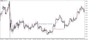
The difference between the TS and a Moving Average (MA) is that with the TS, each time there is a new candle the highest high and lowest low changes, thus the average point changes as well. A MA is smoother, as the concept of threshold doesn’t exist because of the way it is calculated.
A MA will take into account the last 9 candles, add them up and divide by 9, so each time there is a new candle, the calculation will be different, and so will be the line. While with the TS, if there is no new high or new low, the line stays flat and straight, creating a threshold, which describes a lack of trend or a break in the current trend. You can also analyse the slope’s inclination to know more about the momentum of the movement.
• Kijun Sen – KS or Standard Line (blue line)
This line represents the average point of the prices from the 26 last periods, or 26 last candles. It’s calculated by identifying the lowest and highest level, adding them, and dividing them by 2.
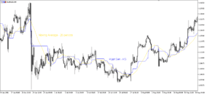
Here, we can see that the period taken into account is longer, so the thresholds are longer and stronger than the ones with the TS. With the KS you will then be able to see major support and resistance levels.
The information given by the KS is essential to spot at first glance where prices are compared to a key support or resistance. The KS line is like a magnet for prices when they go too far away from it: they should come back to that level in one way or another.
We can also see here the difference between the KS and a Moving Average (MA), as with the latter we can’t see horizontal levels.
• Kumo or Cloud
The cloud is composed of 2 lines (SSA and SSB) and is projected 26 periods into the future. This is the 1st aspect that distinguishes the Ichimoku indicator from other indicators, which generally focus more on the present.
o Senkou Span A or SSA – green line
The SSA line is computed by taking into account the average between the Tenkan Sen and the Kijun Sen, so the SSA shows the price’s equilibrium between the short term (9 periods with the TS) and the long term (26 periods with the KS). Then, the result is projected 26 periods in the future.
The reason why prices are projected into the future is because it’s supposed to materialize the price cycle: prices are supposed to come back to important past levels. This is also one assumption of Technical Analysis: “History tends to repeat itself”. Check out our article 3 TIPS TO BUILDING A POWERFUL FOREX TRADING STRATEGY to find out more.
So from that, the reading of the SSA should give you information about future support and resistance levels that prices should face in 26 periods.
o Senkou Span B or SSB – pink line
The SSB line is computed by taking into account the average point between the lowest low and the highest high of 52 periods (same computation as the TS and the KS), and projected 26 periods in the future.
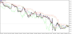
If you’re looking at a longer timeframe you can see the importance of this SSB line – like with this chart of the DAX with a weekly timeframe. With this weekly chart, the average point on the last 52 weeks (or a year) will be projected 26 weeks (or half a year) into the future. The support or resistance levels will then be very important and might trigger a reaction from traders.
o The Cloud
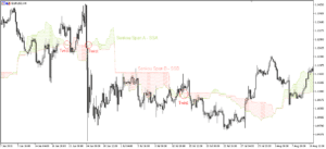
The space between those 2 lines creates the cloud. If the SSA>SSB, then it’s a bullish cloud, which will generally be displayed in green. If the SSA<SSB, then the cloud is bearish – generally in red.
The cloud’s thickness is linked to the SSA movement, as this line is based on the TS and the KS. The SSB is less reactive, as a longer period of time is included in its calculation.
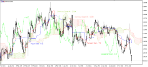
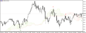
When both lines are meeting, we call it a “twist” – see the red circles on the 1st chart. This usually shows that the trend is reversing, as the positioning of the lines reverses.
Looking at the cloud allows you to have an instantaneous picture of the market: what the general situation is and where the price is trending. You also have a deep multi-timeframe view on long-term and short-term support and resistance levels.
If prices are above the cloud, then the top line serves as the first support level and the bottom line as the second support level. If prices are below the cloud, then the bottom line forms the first resistance level and the top line the second one.
If prices are above the cloud, it’s a bullish trend, and vice versa. When prices evolve inside the cloud, we can assume that the market has no trend, as the previous trend is changing and might be reversing. The side where prices are going out from the cloud is crucial information about the trend, and the cloud’s thickness is important, as it’s easier for prices to cross a twist than a large cloud.
- Chinkou Span or Lagging Span – LS (fluorescent green line)
This line is the 2nd original characteristic of the Ichimoku indicator, which represents the actual closing prices delayed of 26 periods.
This line can be described as the market memory, as you can compare the current price with the price from 26 periods ago. It can help traders to highlight important levels from the past. Once again, it’s about the price’s cycle, as prices are often sent back to key levels. Another important aspect is the space in front of the LS: are there some obstacles in front or can this line evolve freely? This can help you confirm the trend.
Most of the time, you can assume that if the LS crosses prices upward, it’s a buying signal – especially if prices are exiting a cloud. If the LS line crosses prices downward, it’s a selling signal.
As you can see, Ichimoku is a complete market analysis system that takes into account a wider time horizon: you can see actual prices compared to the past with the Lagging Span, and you can visualise present and past in the future thanks to the cloud.
The way the lines interact with prices show us a balanced or unbalanced market, of which a trader can take advantage by understanding and forecasting money-making investments opportunities. It’s about following the trend, not going against it.
To summarize, the Ichimoku indicator is composed of:
- 2 lines representing average points on 9 periods (Tenkan Sen) and 26 periods (Kijun Sen). Those lines are the present equilibrium. They can be read as a moving average (MA), but they will show more threshold than the MA. The KS will be more important than the TS, as it can be considered a signal line. Those 2 lines could be described as the “market pulse”, as the TS shows price volatility and the movement’s strength according to the slope’s analysis, and the KS shows important levels where there is an “equilibrium” situation.
- 1 cloud representing a balanced price’s zone on the past 17 periods and 52 periods projected 26 periods in the future. This line is the present balance’s situation in the future, and you can see support and resistance levels.
- 1 line representing closing prices delayed in the past, called the Lagging Span. This line could be described as “the market’s memory”.
Regarding market sentiment, we could summarise it this way:
- Bullish situation
- Prices are above the cloud
- Lagging Span line is above prices
- The cloud is “green” in the future: SSA>SSB
- Tenkan Sen line is above the the Kijun Sen line
- Bearish situation
- Prices are below the cloud
- Prices are above the Lagging Span
- The cloud is “red” in the future: SSA<SSB
- Tenkan Sen line is below the the Kijun Sen line
START LEARNING FOREX TODAY!
share This:


November 18, 2016 at 7:10 pm, Mike Humbke said:
Thanks for making this tutorial. The pictures are quite small. Anyways to enlarge? Thanks!
November 21, 2016 at 3:41 pm, Martin said:
Hello Mike,
We have enlarged the images, let us know if you can see the graphs well.
What was your favorite point regarding this guide?
We will be releasing a Second Part this week so stay tuned!
Regards,
Martin
ForexBoat Support Team
January 07, 2017 at 11:45 am, Boon said:
Hi CAROLANE, thanks for making this post about the Ichimoku indicator as I always wish to know more about this indicator (though I’ve never used it).
Glad to know that Martin has enlarged the images so that we can see them clearly together with the explanation (also need to thank Mike for asking about the images enlargement).